Summary
Redesigning Niagahoster's checkout page
TL;DR
By applying Hick’s Law with a step-by-step progression will be advantageous not only to the users but also to the company as a whole, as it can help to reduce user’s cognitive load and retain their focus. My role includes: wireframing, prototyping, usability testing.
Results: 5 screens of checkout process interface to tackle the cognitive overload problem.

Context
Decreasing in sales
Niagahoster is a prominent web-hosting business that provides an extensive range of hosting options to its customers. Nevertheless, the company’s research division has uncovered decrease in sales.
Conflict
Interesting findings from research division
Research team found that users are frequently confused when selecting a hosting plan, leading to extended decision-making times and end up quitting the payment process.
Using Hick’s Law to tackle the problem
Simplify the hosting plan card with fewer words
Making a comparisons between the plans
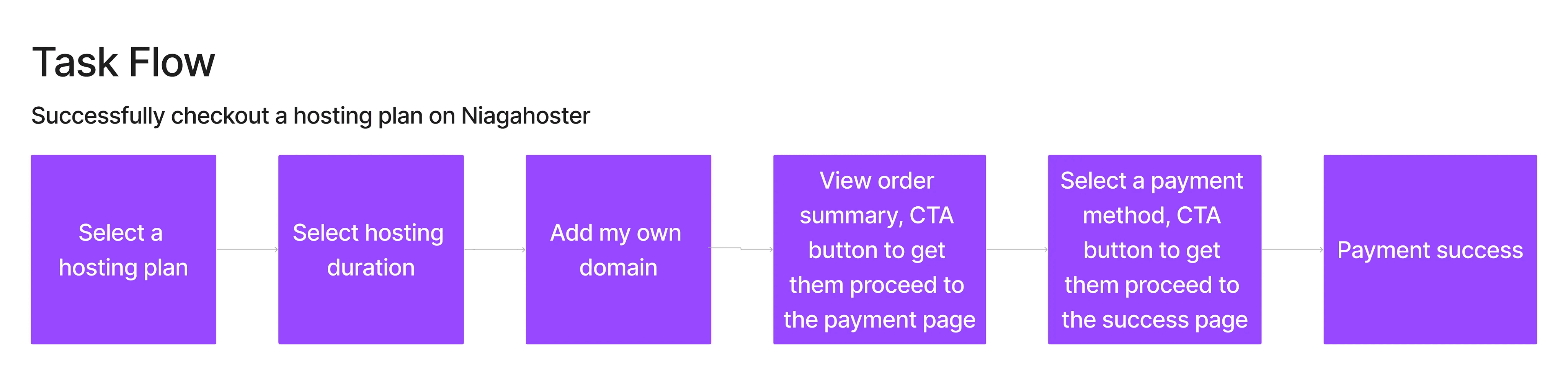
Use a step-by-step process in the checkout page
Rising Action
Step-by-Step process
To address this concern, I’m using Hick’s Law as a basis for revamping the checkout procedure. My thought is to simplify the hosting plan card with fewer words and to compare the available options, making it easier for the users to grasp.
Besides, I’m proposing a step-by-step process in the checkout process, where the first step is visible and the following steps stay hidden until the user finishes the first step. This strategy is intended to reduce the burden on the user’s mind that is caused by numerous steps on one page.
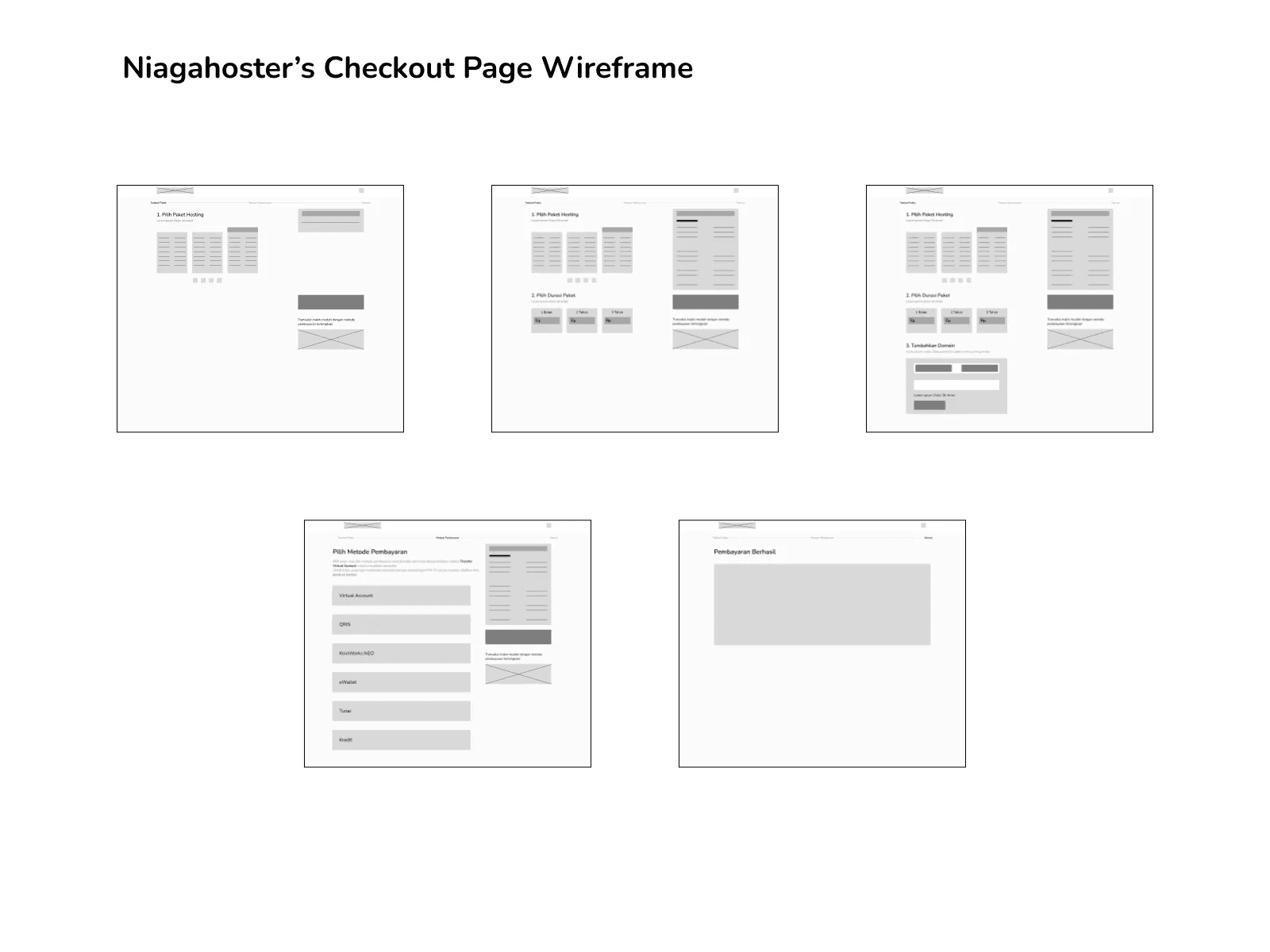
Crafting low-fidelity wireframe
Low fidelity wireframe serve as an initial design and to visualize the step-by-step process in lo-fi which was then further developed into a high-fidelity wireframe that will be used for the usability test.
Climax
High-fidelity will bring us closer to the final product!
Polishing the lo-fi into hi-fi wireframe using their style guide. High fidelity also formed as a final design which then used in usability test.

Falling Action
Testing the design to potential users
To make sure the design is as effective as possible, I tested it with people who are already knowledgeable in hosting services. The test was conducted to evaluate how well the overhauled version leads users to checkout, decreasing their cognitive burden.


Findings #1: Helps user to be more focus on the current step
One of my findings is that using this step-by-step design may help users to be more focused on the current steps. This approach may help to reduce users’ cognitive load that can lead them to be overwhelmed.
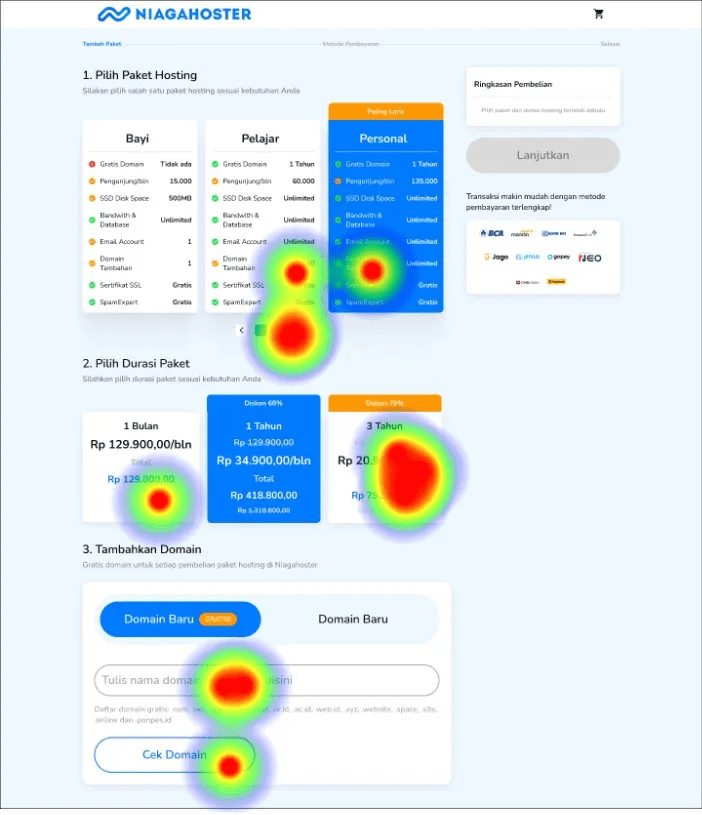
Findings #2: My design still has flaws in retaining users’ focal point
The image on the right shows how the user started to click anywhere but the current steps. One user said they seems in doubt when choosing the option that was available. One said it still has too many words on one page.
Resolution
Takeaway
By applying Hick’s Law with a step-by-step progression, wireframing, and usability testing, I’m taking a thorough approach to enhancing the user experience when it comes to selecting a hosting plan. This will be advantageous not only to the users but also to the company as a whole, as it will boost conversion rates and help business growth.