Summary
Redesigning FundEx's mobile landing page
TL;DR
FundEx’s Business Development Division discover a high interest in investment from young worker aged 20-30. FundEx wants to expand their market segment by adapting its approach based on user behavior that aged 20-30 years old by redesigning its landing page to be more youthful but professional. My role includes: wireframing, prototyping.
Results: 6 screens of high fidelity interface to suit young investors preference.

Context
Research findings
FundEx’s Business Development Division discover a high interest in investment from young worker aged 20-30.
Conflict
Expanding the market
FundEx wants to expand their market segment by adapting its approach based on user behavior that aged 20-30 years old
Opportunity arise
Redesigning its landing page to be more youthful but professional.
Rising Action
Learning about the page
There are some pros and some aspect that need to be addressed such as adding copy to the sharia funding section and reorganizing the disclaimer card. This iteration will give a pleasure experience for the new investor.

Moodboards
After learning FundEx’s landing page, I am creating a moodboard to ideate how I might design its landing page to be more suitable to younger investor.
Crafting low-fidelity wireframe
I design a low fidelity wireframe to visualize my layout idea without compromising FundEx’s user- friendly design.

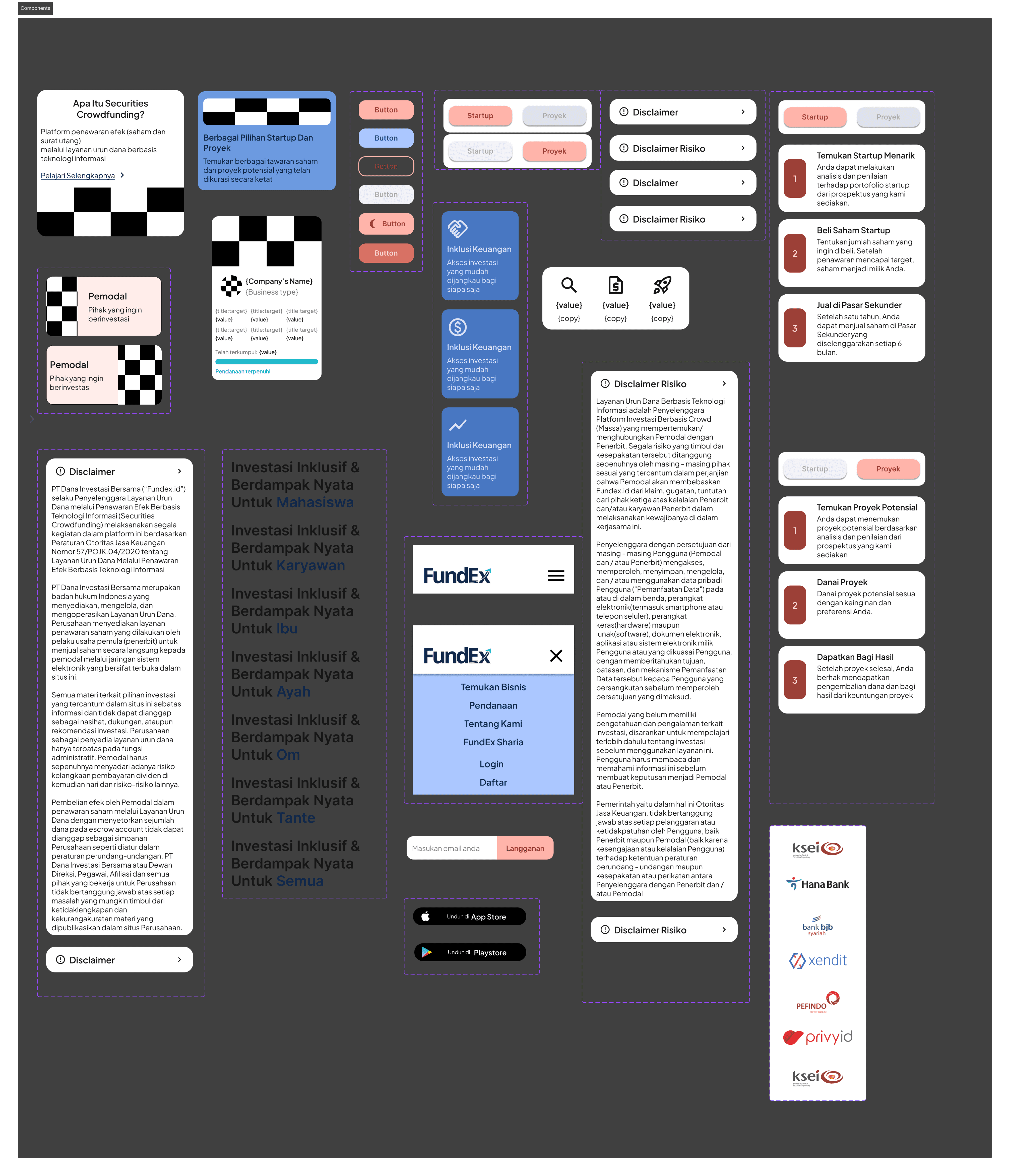
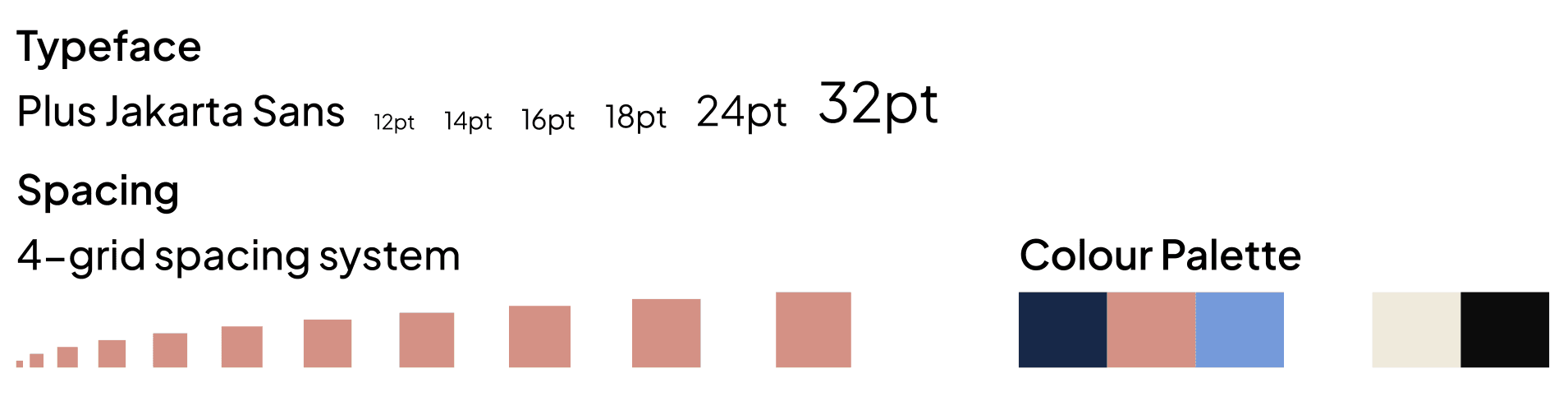
Designing the atomic components
On day 3, I started to build a mini design system to keep the design consistent.
Climax
Tailoring the high level of user interface
In this phase, I started to design a high fidelity based on wireframe and design system that I build. I modify some of the copies to suit the end user. I also manage to do a simple prototyping in some of the components to be more dynamic

Resolution
Checkout the full prototype